Quitting sucks, yet I am ready to quit as co-chair of the Los Angeles AAJA convention. However, one of my co-chairs and the chapter co-president both, in all earnestness, asked me to reconsider, so I’m going to lay out why I want to quit, especially since I do not desire to be one of those AAJA members with secret alliances and enemies within the organization. Maybe that’s an Asian thing, maybe that’s a non-profit thing, but it ain’t gonna be me.
First, some background. I was not the first co-chair of this convention. I stepped in when a former board member, Caroline Paras, quit working with the Los Angeles board without any notice. I stepped in when she quit because we needed a convention chair. Then, when it came time to submit a logo to AAJA’s national staff, we searched high and low for a graphics designer who would be willing to shoulder the work. The chapter even offered a $250 stipend for logo ideas. No one bit, so I broke down and did what I didn’t want to do — roped Trinity in to help us out. And he did.
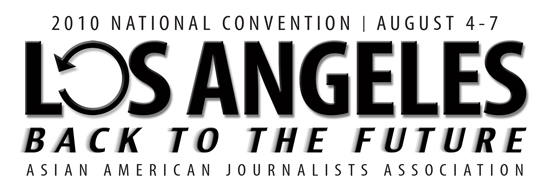
Here is the logo that Trinity developed, based on the convoluted directions from national’s events coordinator. I won’t name her, but we all know who she is. The bullet points that we were told were:
- the logo needs to encompass the “Back to the Future” theme, have the dates, location, etc. on the logo
- the logo needs to have a national appeal—we will be using the logo for all branding purposes of the convention which means it will be used on the website, the convention book, registration book, the kiosks at the career fair and registration, and anything else
- it should have a “modern” aesthetic
- there should be emphasis on a journalism convention as a destination point and less emphasis, but still balancing out, that the convention is in Los Angeles
- then later, we were told we had to spell out “Asian American Journalists Association.” Hence the line along the bottom.
An email telling me about how a friend didn’t like the new convention logo and asking what happened to Trinity’s logo is what drove me over the edge today. Here’s what’s on the AAJA site:
![]() And, here is what my friend (a graphics designer) emailed me about it:
And, here is what my friend (a graphics designer) emailed me about it:
I just saw a new convention logo on the AAJA site and I think it clearly needs some art direction.
The text design is awkward, and doesn’t look balanced at all. I’m waiting for the word “Back” to fall off the proverbial truck. And the words “to” and “the” aren’t big enough to hold the weight of the rest of the words.
The arrow is too skinny, and doesn’t look balanced with the weight of the type. And it’s placement looks awkward, like it’s growing out of the K in “Back.” Shouldn’t it look more like a refresh icon, like we were talking about earlier??
And the red color is rather bold, but the gradient is distracting to the eye. Why red? What is the story behind this color?? It is intended to look screaming hot or is it intended to be another one of those “Asian” colors.
The logo I [saw from] Trinity looked much more cohesive and put-together than the mess I saw online.
I’m disappointed it was changed, and not sure how this new logo looks better than the original. If anything, it looks plain and unimaginative. I’d love to hear the story behind it’s creation.
Just wanted to you know that I don’t like it at all. :)
Yeah, I don’t like it at all either. Especially since it minimizes the fact that the convention is in Los Angeles (hello???? No one is going to ask anyone “Are you going to the ‘Back to the Future’ convention?!'”) and after all the back and forth about how AAJA absolutely had to and needed to be spelled out, there it is, as AAJA. !@$&
And, let me just show off the convention booklet mockups. We haven’t seen the actual book yet, but I’ve seen a mockup with this logo, and let me tell you. It ain’t pretty.
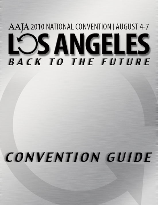 Trinity's cover mockup |
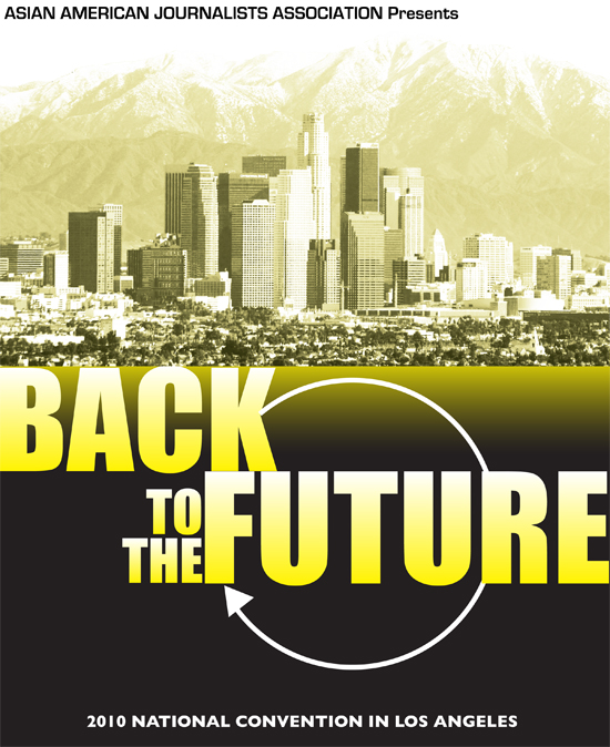 What national wants instead |
Funny thing is, when we were all discussing the logo, one thing we had all agreed on was — no stereotypes like red or yellow (Asian) colors, no city skylines (since San Francisco, New York, Minneapolis and Miami all did that), no L.A. fallbacks like a Hollywood star, the Hollywood sign or palm trees. So…why’s the picture of L.A. gotta look like someone peed on it? I just had a baby, and one thing that new parents always look out for is jaundice. And baby, this mockup on the right looks jaundiced. By the way, Trinity’s mockup has the original logo, with the AAJA logo on it, before national (rather, one person in particular) insisted that AAJA had to be spelled out.
Now, it came to be that national opted to “move forward” with another designer (someone who has been trying to play like he’s Trin’s graphics editor from the other side of the country) because:
- I had Michael early and was suddenly, along with Trinity, out of commission.
- National did not want to go with Trinity’s cover, apparently because it would cost too much to print it properly. I know — when that happens, you say, “well, let’s shop around for a printer who will print it properly for the right price.” But National does not want to change printers. In the flower business, that’s usually because there’s kickbacks, but who knows in this case.
- Trinity asked National for some old school photos for a new cover he had in mind, but National replied that they didn’t have access to high-res photos of the nature he wanted. Later, Henry Fuhrmann, a veteran L.A. chapter member, pointed out to me that National has published several periodicals and newsletters featuring such photos, so why wouldn’t they have them?
- They had another designer, whom they apparently believe has sunshine coming out of his nether regions, waiting in the wings to swoop in and redesign Trinity’s logo and concept. With a veritable rainbow of colors. Great.
So, here’s my issue. I do not want to quit over the logo. I want to quit because of the complete disregard national has for the L.A. chapter’s hard work. It’s not just the miscommunication over the logo, and trust me, if national had actually said, we simply don’t like the logo, we could have worked on it. But, no. They did not, so we didn’t change it. Instead, national just turns around and allows someone else to revamp Trinity’s concept (which was a piss poor job). But that wasn’t even the extent of the miscommunication. National also let an L.A. committee scout out opening reception sites (including some serious scouting at the Disney Hall, which inspired Trinity’s logo) without telling us in the first place that they were simply going to have the opening reception at the Highlands to help meet their food and beverage quotas.
It pisses me off that National disregarded the fact that I stepped in after another co-chair dropped off the face of the Earth and that Trinity stepped in to help with a logo after we couldn’t find anyone willing to do it — and he’s not even a member. Dude, if this “designer” wanted to do the convention graphics in the first place, he should have done so and I would have been a happy camper. But it pisses me off that he came in after someone already submitted a design, and tried to put his spin on it, making for a less sophisticated logo that invokes nothing, much less Los Angeles. Maybe if Trinity and I were getting paid for all the grief, late nights and repeated, rambling emails we have been dealing with, then what can we say? But the only one getting paid here is the national staff. And you cannot treat volunteers like this without blow back.
So. After all that — should I quit? I don’t want to quit and am not a quitter. But it seems that my work doesn’t seem to matter, so why should I even bother? Trinity supports me either way, and advised me that if national has taken the fun out of the work I do for AAJA (and I’ve done quite a bit in the years I’ve been a member), then I should quit. And I’d say that if I have to deal with this national staff member again, then it won’t be fun for anyone involved. Nor does anyone want me to be anywhere around this “designer.” So, take the poll and leave a comment, please. And we’ll see how I decide later on.
*I’d also like to add that I wanted to write this post two weeks ago, but was going to talk to Sharon Chan about the situation. But seeing that the logo was replaced entirely, instead of national simply going with a different designer for the convention booklet cover, really set me off.
First, I completely agree that the new logo looks shoddy compared to the old one. I don’t have the eye of a designer, but, yeah, the person who designed the new logo forgets what they’re advertising. The skyline design is also so cliche… I really don’t have much I can add to what you’ve already said.
I wouldn’t be upset if you did decide to leave. It sounds like you have enough of a good reason to leave. Who in their right mind intentionally surround themselves with…
My reason for wanting you to stay: I think the convention ends up better if there is a vocal critic of National in a powerful co-chair position. I encourage you to be a witch, speak your mind forcefully and loudly, when talking to National and have them forcibly remove you from the position.
That’s what I’d do… but I imagine that would be pretty draining. Best wishes deliberating.
I think the arrow is going the wrong direction in the new logo.
gah… if it helps you feel any better, i deal with this sort of crappy power struggling/give-and-take with clients… and internally… ALL the time. vent and vent and vent… then get back in the ring and kick some buttocks.
If this is robbing you of even one moment of joy with Michael, step away from the train wreck.
Darlene, now you know why I had the reaction I did when you asked me to join AAJA again. Unfortunately, this kind of thing is common in all organizations. “No good deed goes unpunished,” true? Yes. While I agree with John Sakata’s argument, the more important factor right now is your baby. You will never get this time back. And while having a child shouldn’t mean putting everything else on hold, you need to take care of Michael, your relationship with Trinity, and YOU. As important as it is to stick with it and be that opposing voice, it’s also important for those who are “in control” to learn that when people aren’t respected or treated fairly, they leave. And you lose good people.
Kiss the baby for me. Breathe. You’ll know it’s the right thing to do when if feels good. xoxo
They should have Back to the Future conventions in general, not just for Asian-American journalists. Lots of people really like that movie.